
RON’S GONE WRONG
Feature Film - Production Designer - Locksmith Animation
I worked on the movie from 2017 to 2020 as Production Designer. I was in charge to define the look of the film alongside Nathan Crowley, and lead the art team for characters and set designs, as well as oversee the CGI fabrication (modelling, surfacing, lighting/comp) of the film which was made by Dneg’s new animation division in London.
For this movie we initially wanted a very stylised CG look, with pushed shapes, painted textures and stop-motion lighting look but we eventually had to gradually backtrack from this initial intension during the production. Many of the most stylised concepts below are from this early part of the making of the movie.
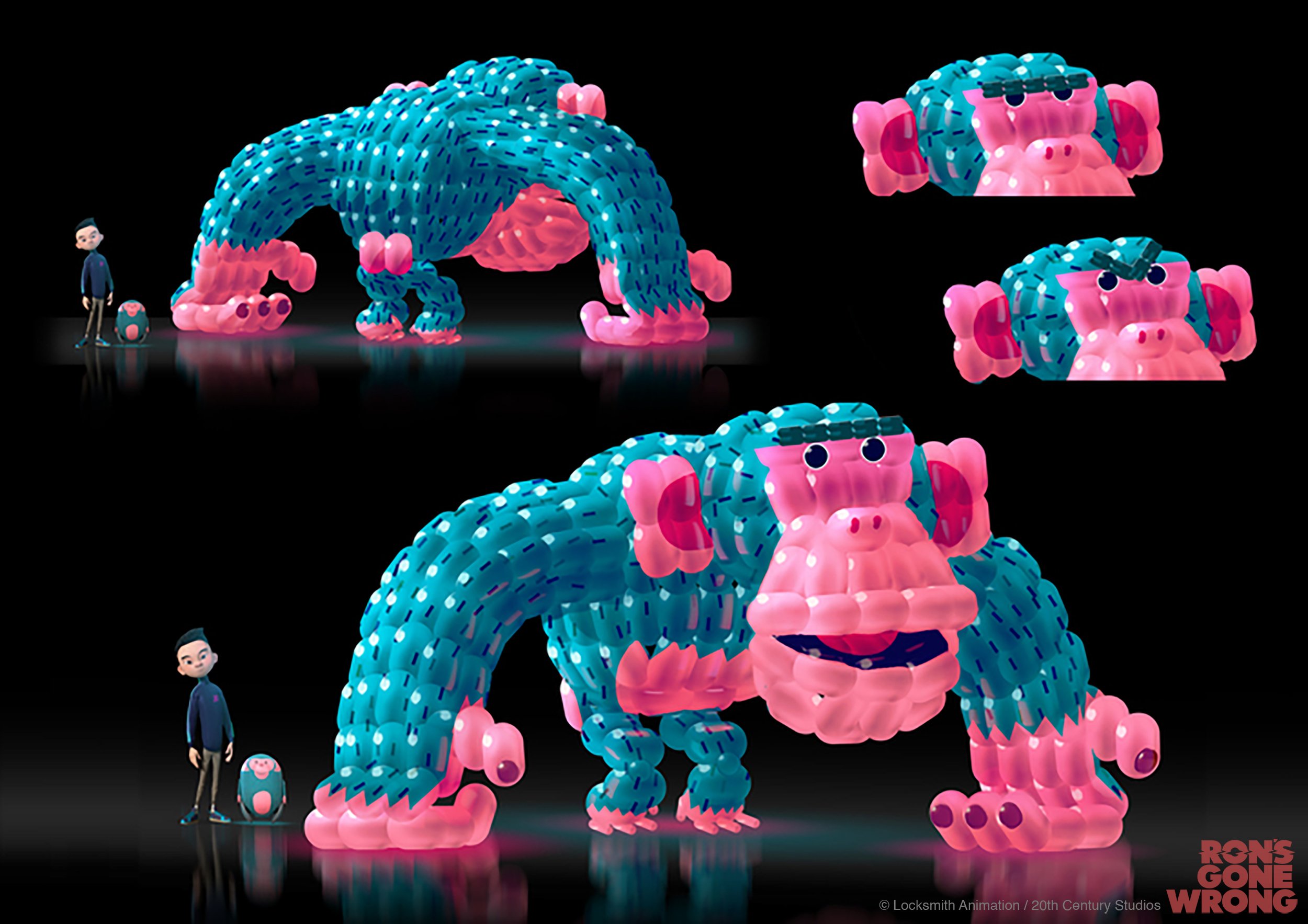
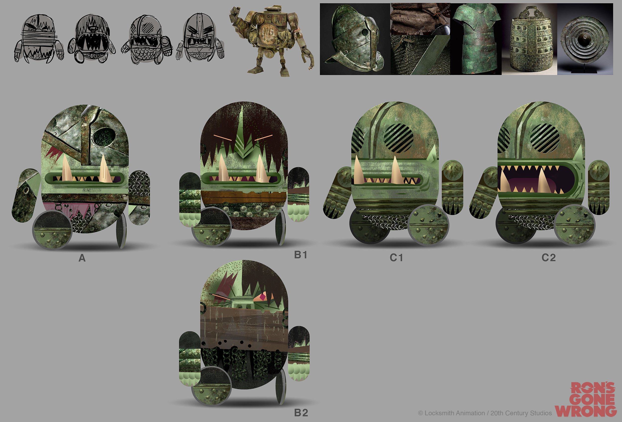
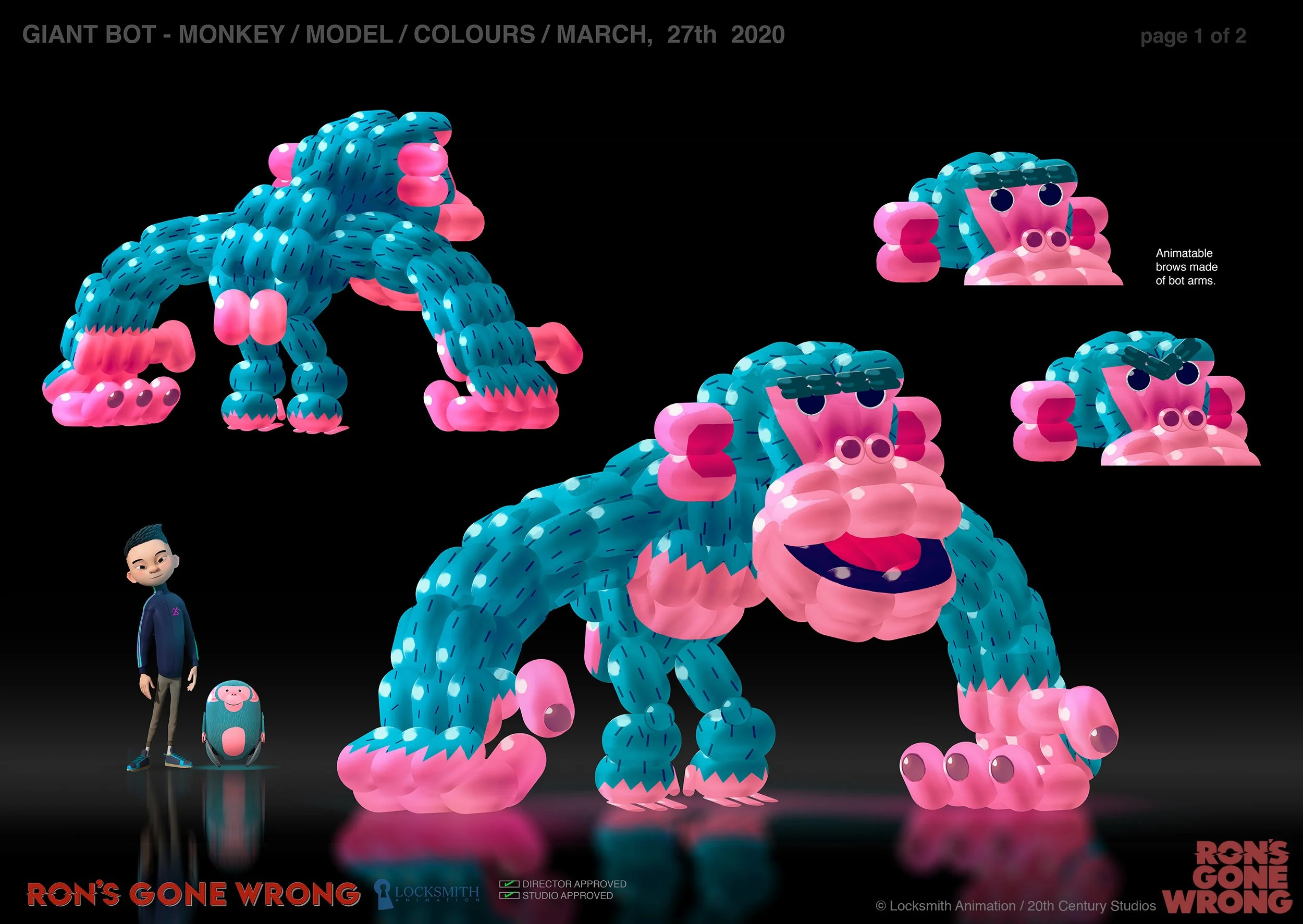
CHARACTERS
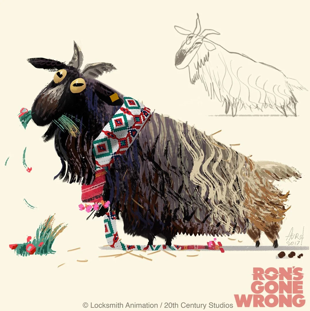
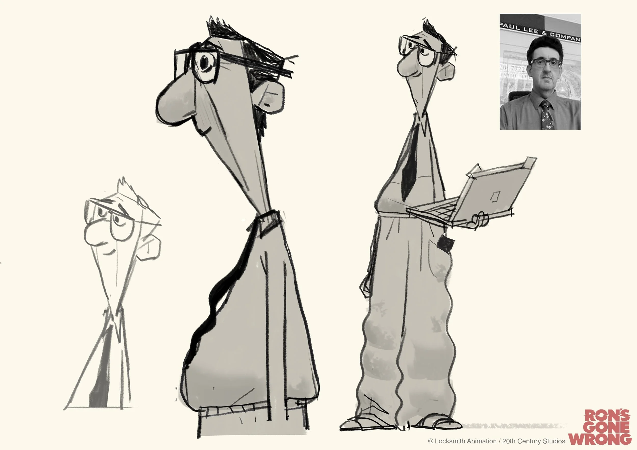
I had the opportunity to work on early designs explorations for various characters of the movie. The final character designs were made by Julien Bizat and Tim Watts, with development designs by Sylvain Marc, Joe Moshier, Carter Goodrich, Taylor Krahenbuhl, with sculpts by Michel Guillemain. The images below are a mix bag of paintings based on the work of some of those previously named artists and characters I fully designed myself like the goat and the chickens, or more free exploration like the bullies gang:


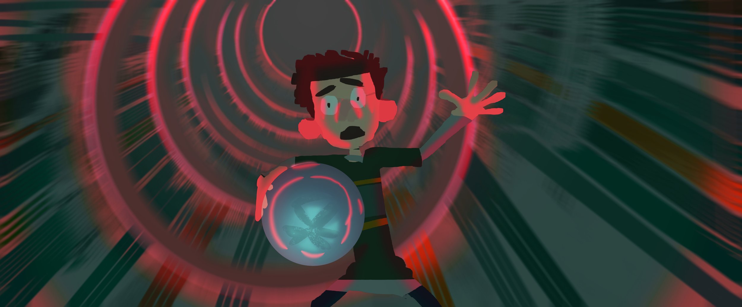
RON
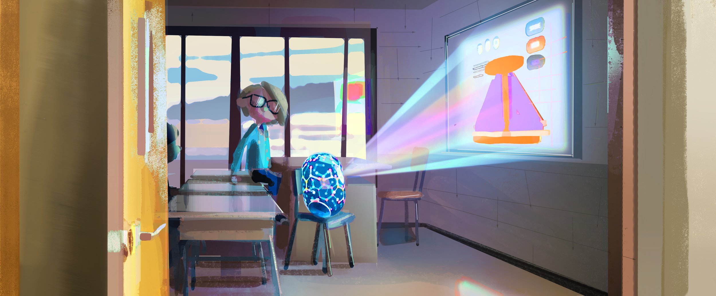
Exploration and final designs for Ron, the malfunctioning bot. The pill shape has quickly been locked but we spent a long time to find the look of the inside parts.
As Ron is transparent its inner mechanism was a big part of his design. It had to be believable (not too sci-fi) so it looks like an expensive hight-tech toy, but also simple enough so it didn’t distract from the animated face which appears in surimpression on the outer shell. After many versions we went for a simple semi-opaque inner pill shape containing in its bottom part the circuits boards and over mechanisms.


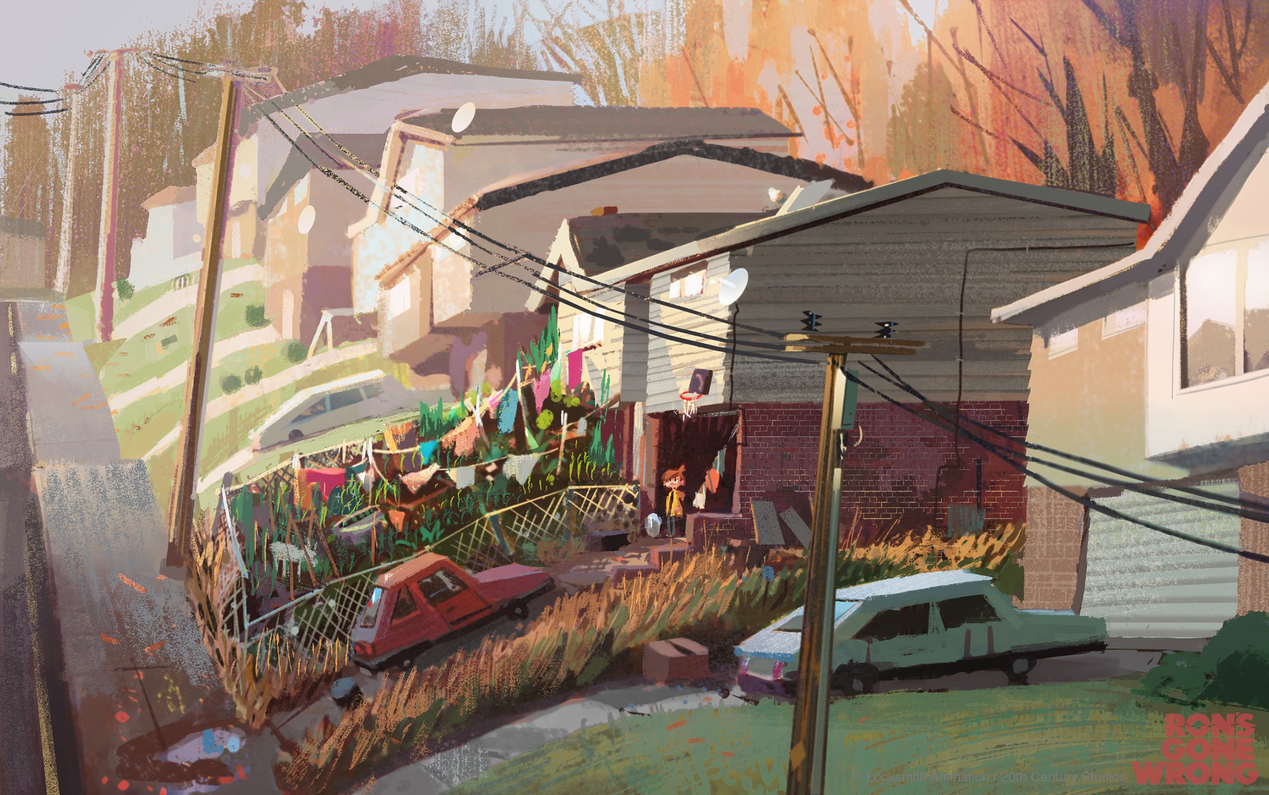
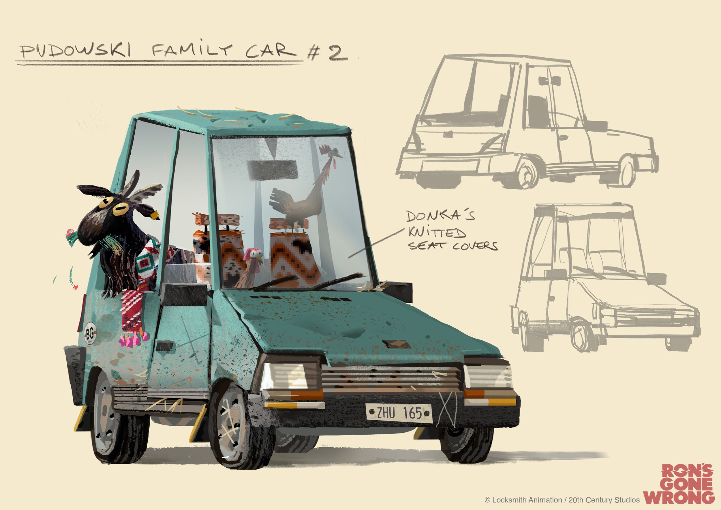
BARNEY’S HOUSE
The house in which Barney, his dad and his Bulgarian grandma Donka live. The idea is that Barney feels ashamed of the house and his quirky family, and so doesn’t want to invite any friends around. That concept below was one of the very first ones I did, in early 2017, and although the house shape and scale evolved through the design process, the overall idea staid quite the same in the final movie. The messy vegetable front garden was definitely the most fun part to develop! Shame we actually don’t see it that much in the final cut of the movie.


Early CG lookdev image of the kitchen. Design by Nadya Mira, Mike Redman and myself - Modelling by Joaquim De Brunier - Surfacing & lighting by Irina Nguyen-Duc.
DONKA’S LAPTOP
In the early versions of the script, Barney’s grandma, Donka, had this laptop that she used as a kitchen shopping board. It was a remain of her youth as an engineer during the soviet era, which was then playing a pivotal role in the movie. But as her storyline evolved and her ex-computer scientist past wasn’t used anymore in the story, this prop got cut from the script. Nonetheless I had so much fun researching and designing this prop from the early computer era.


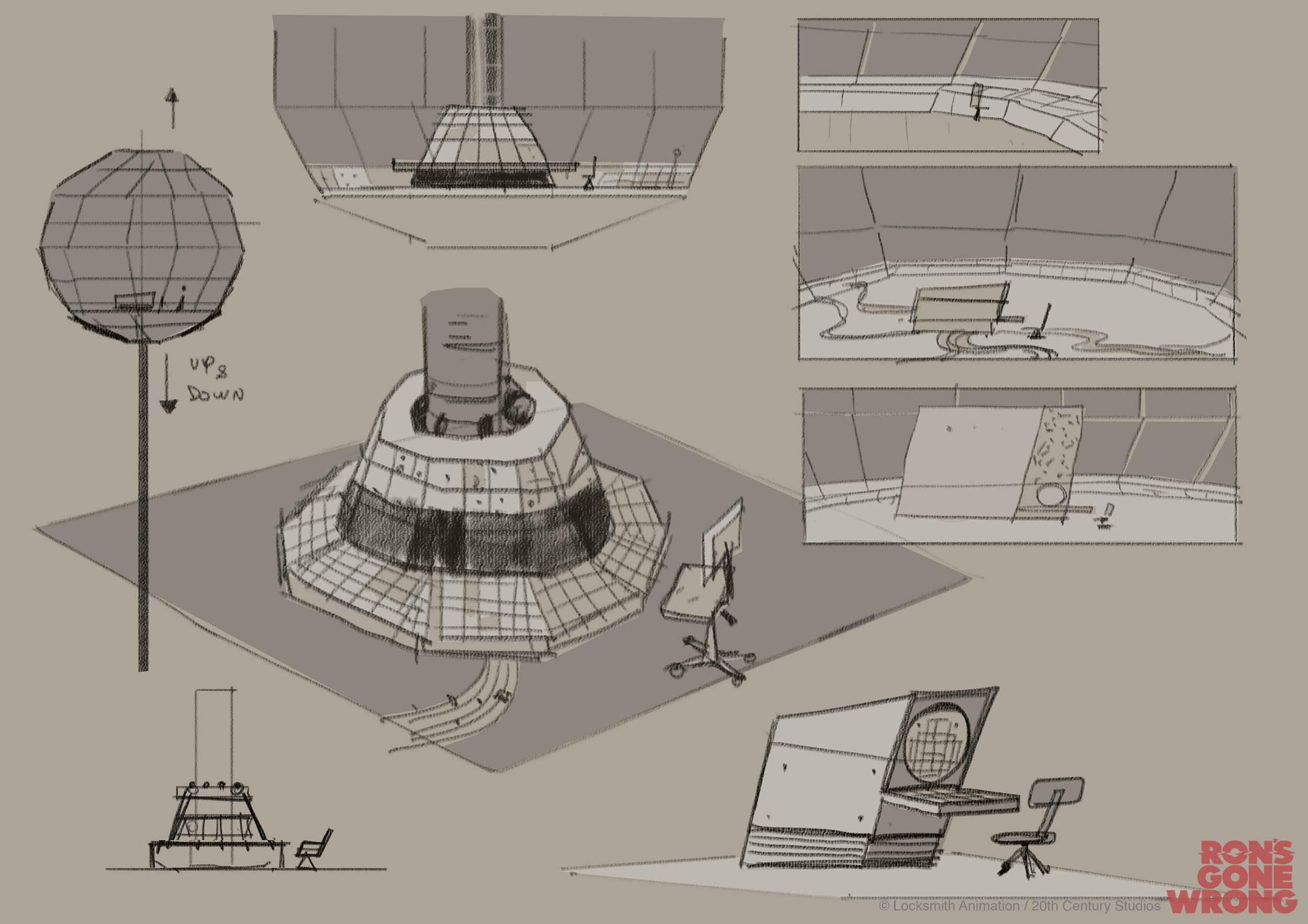
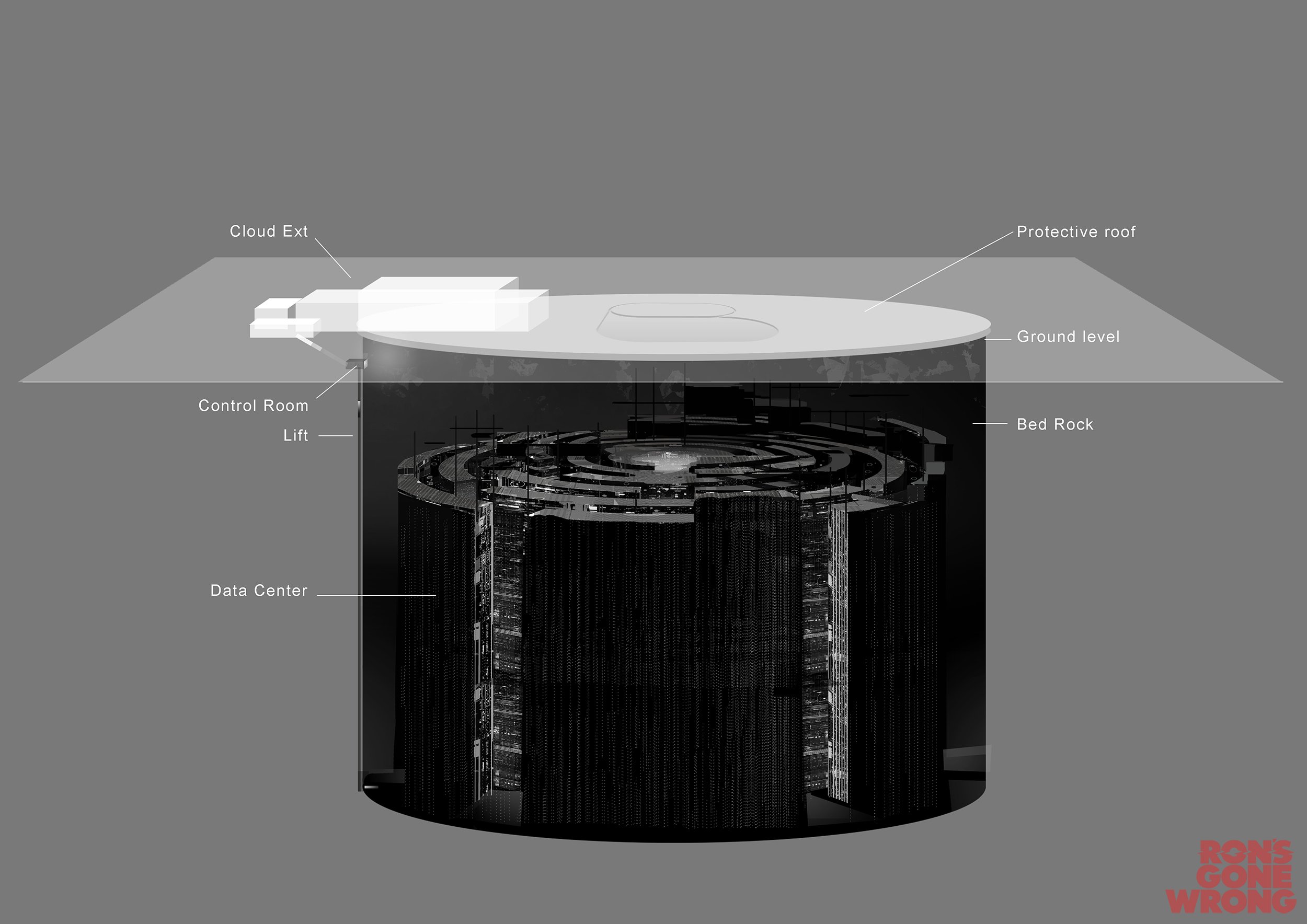
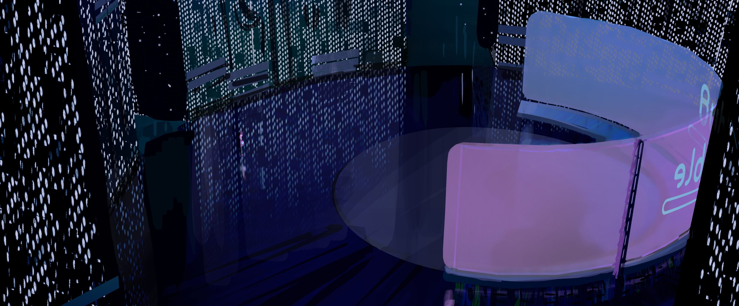
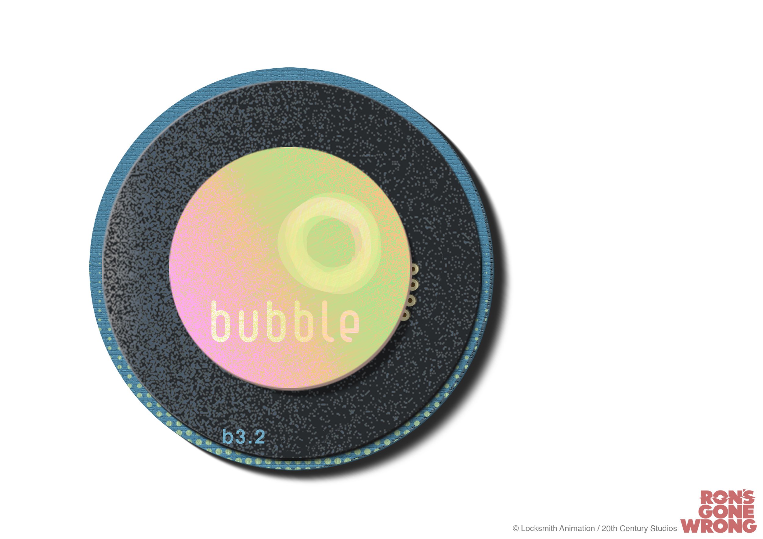
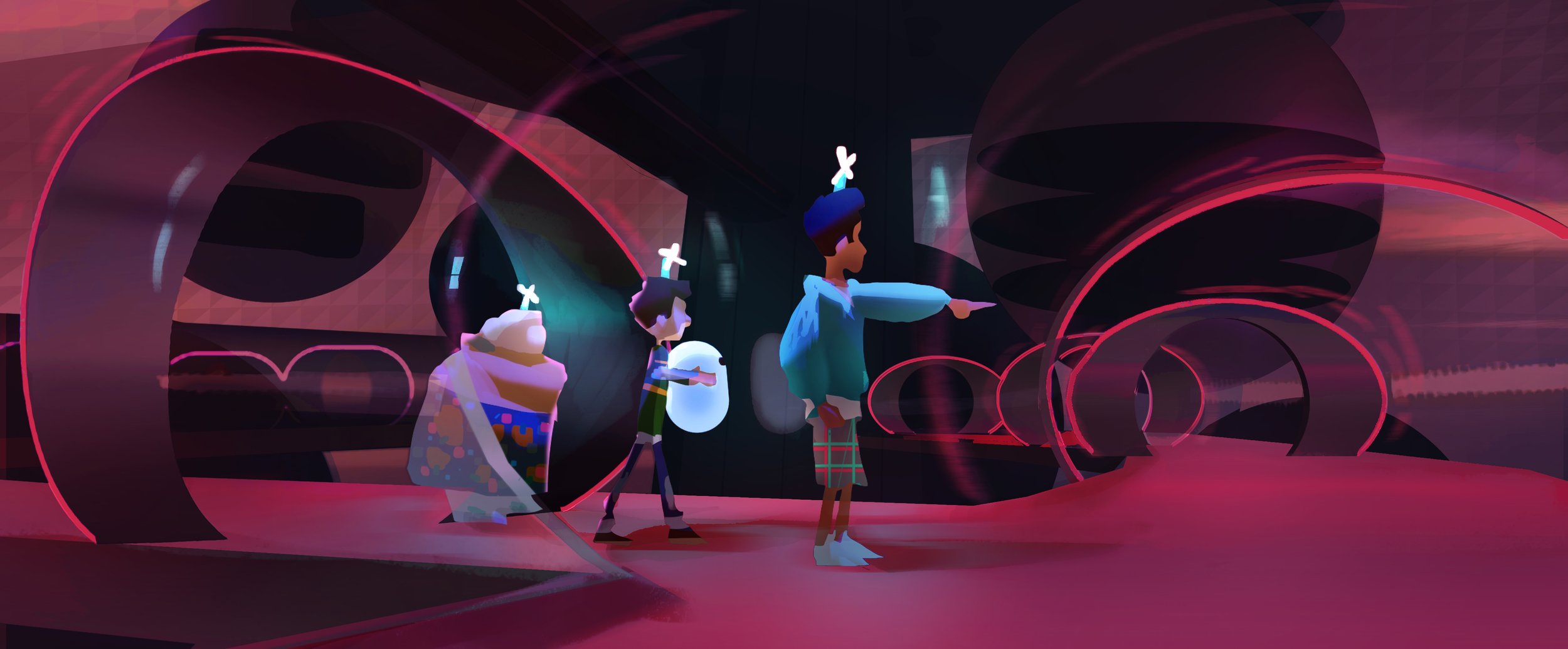
BUBBLE HQ
The Bubble HQ is a massive structure perched on top of a dam, housing the work force and servers of Bubble, a giant tech company (think Apple+Facebook+Amazon).
Everything is spherical and transparent. Nathan Crowley has been very influential on the design of the Bubble architecture, defining visual ideas from which I then could extrapolate and push further to final design with the art team. The work of James Turrell has also been an inspiration for those sets. Below some of my paintings and designs:


Early CG lookdev for Mark’s office. Design by Nathan Crowley, Antoine Birot, Mike Redman and myself. CG modelling and lighting by Maximilien Bougeois, surfacing by Irina Nguyen-Duc and Maximilien Bougeois.
Color keys:


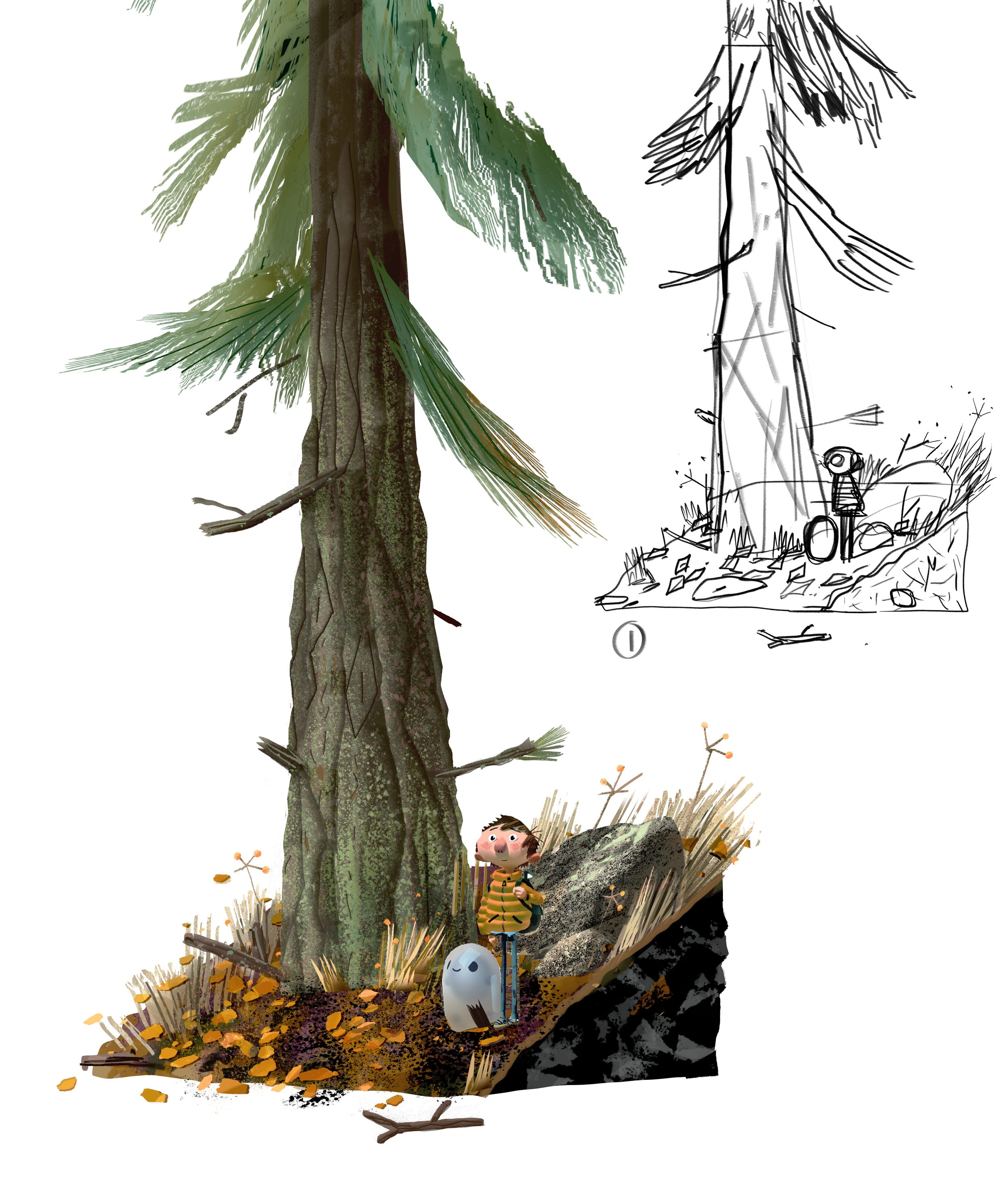
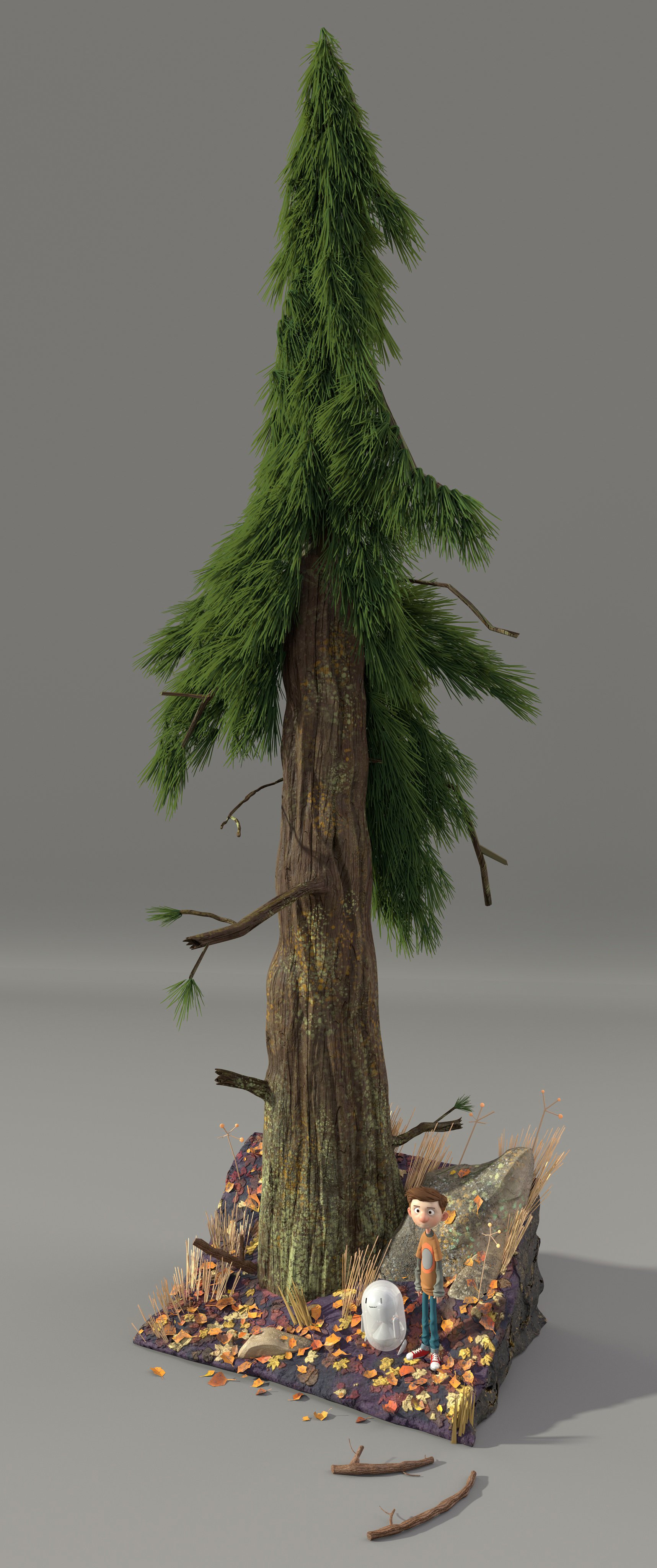
THE FOREST
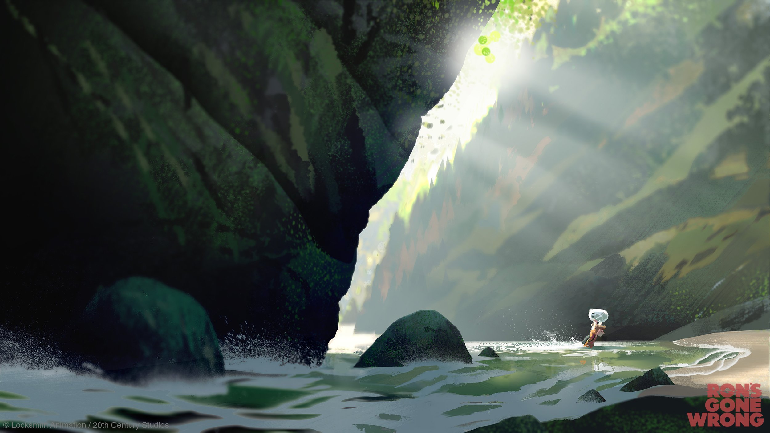


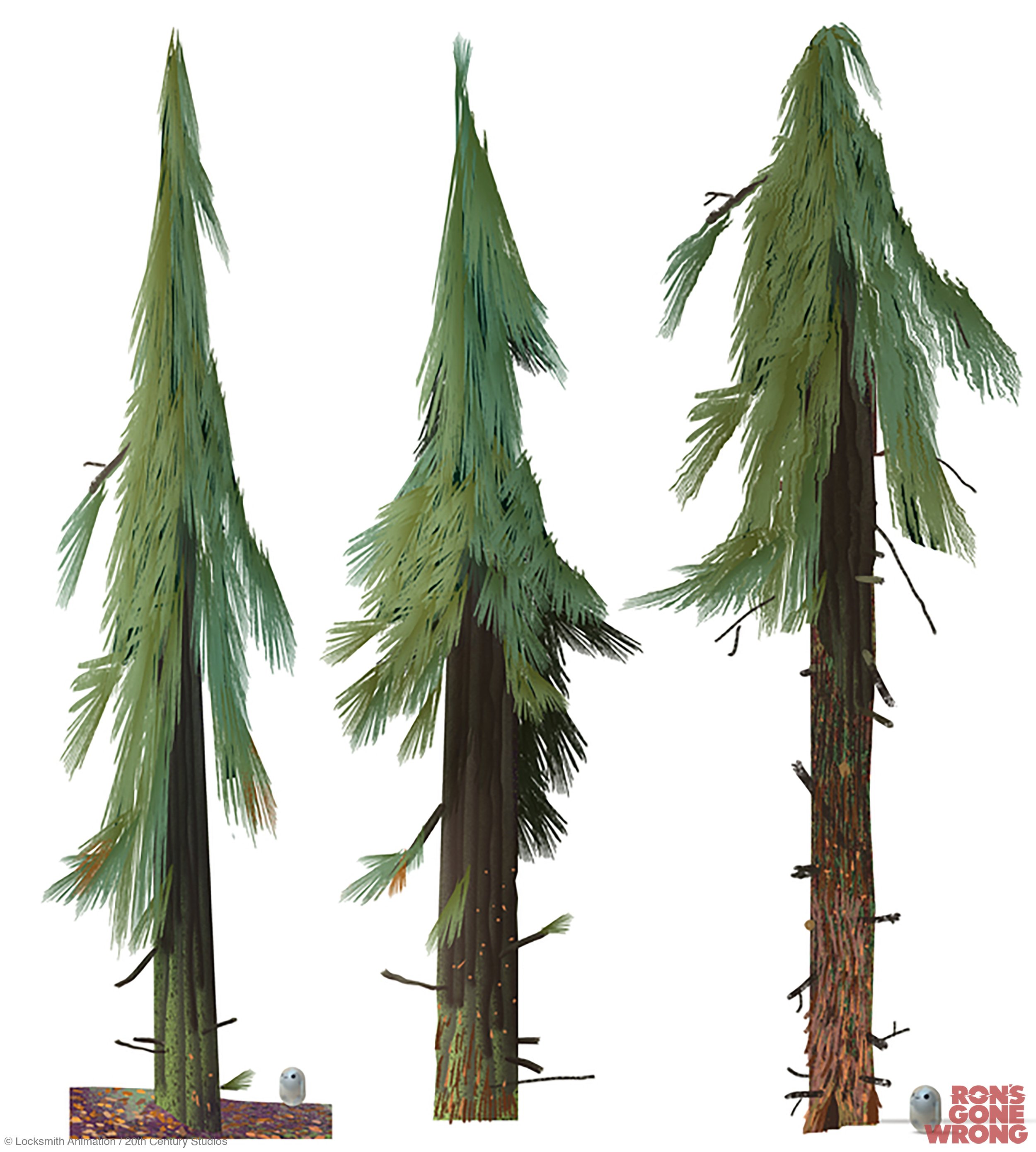


Below, early lookdev for the forest. Design by myself and CG modelling & surfacing by Irina Nguyen-Duc:

Color-keys:


NONSUCH
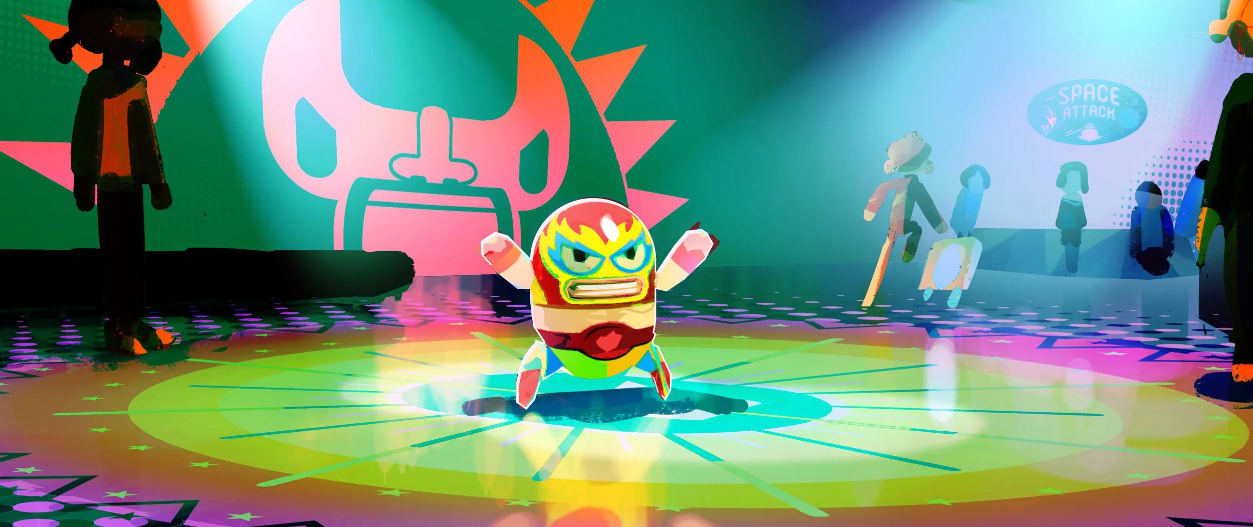
The city of Nonsuch, where most of the movie takes place, is supposed to feel uneventful and quite uncharacteristic.
So to try to get visually this sense of boringness I played with stretching the shapes to maximise the empty spaces.
That’s a shape language principle that we then tried to keep through the design process of the different houses, buildings and props.


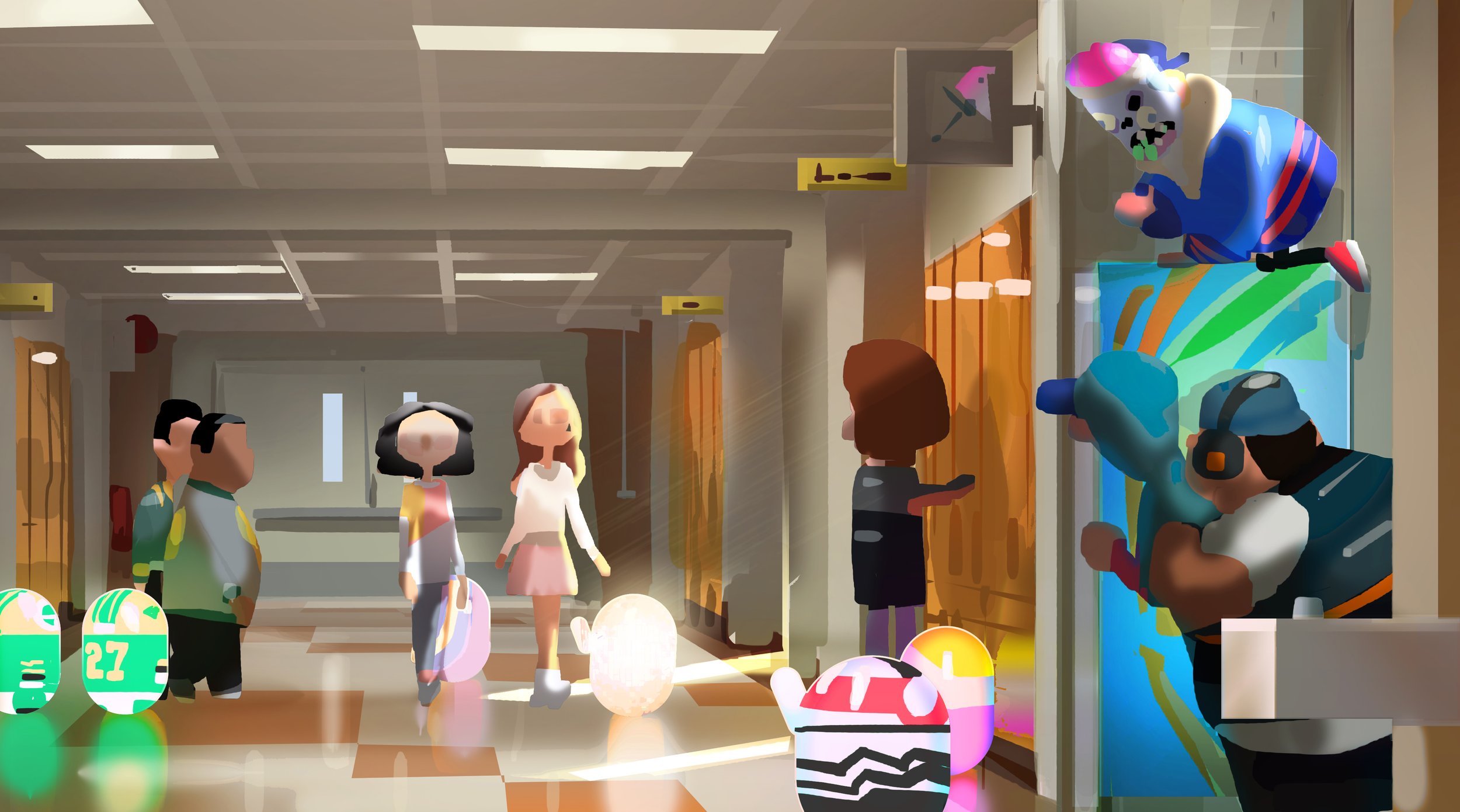
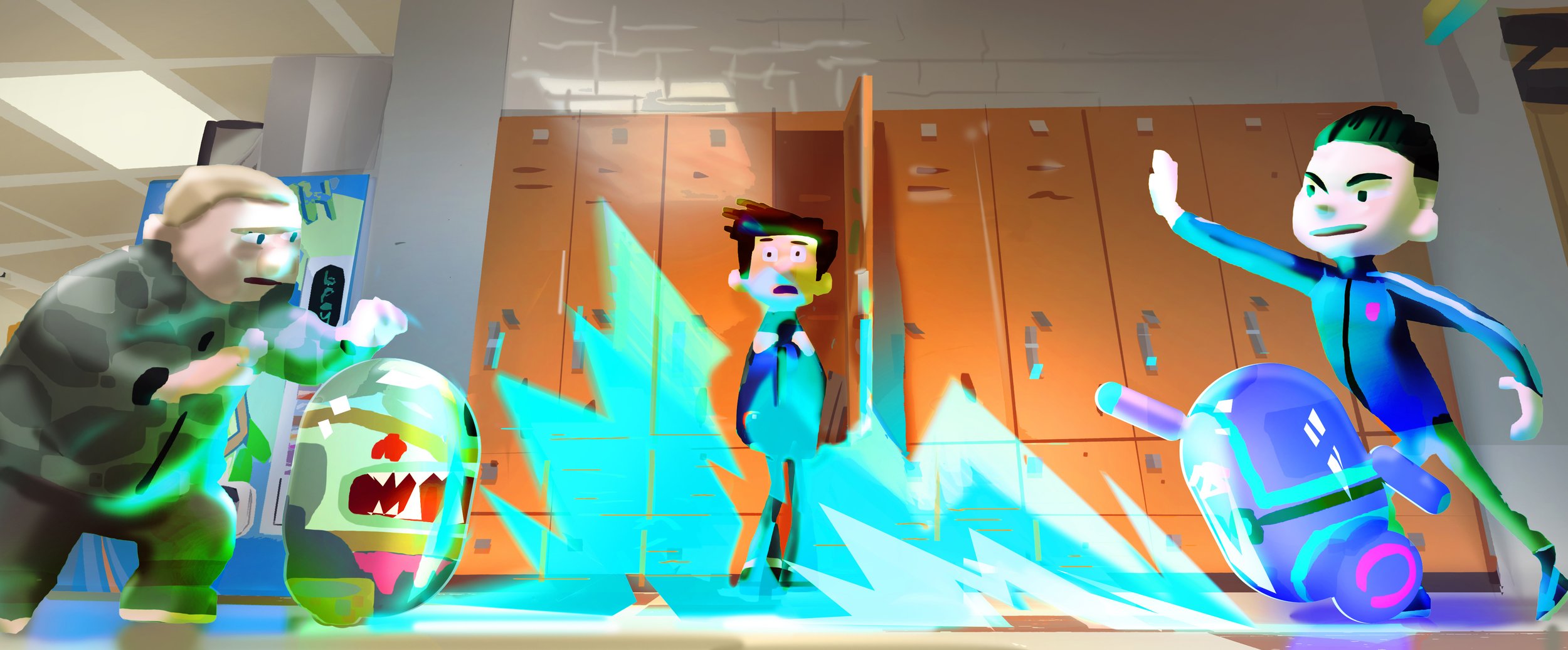
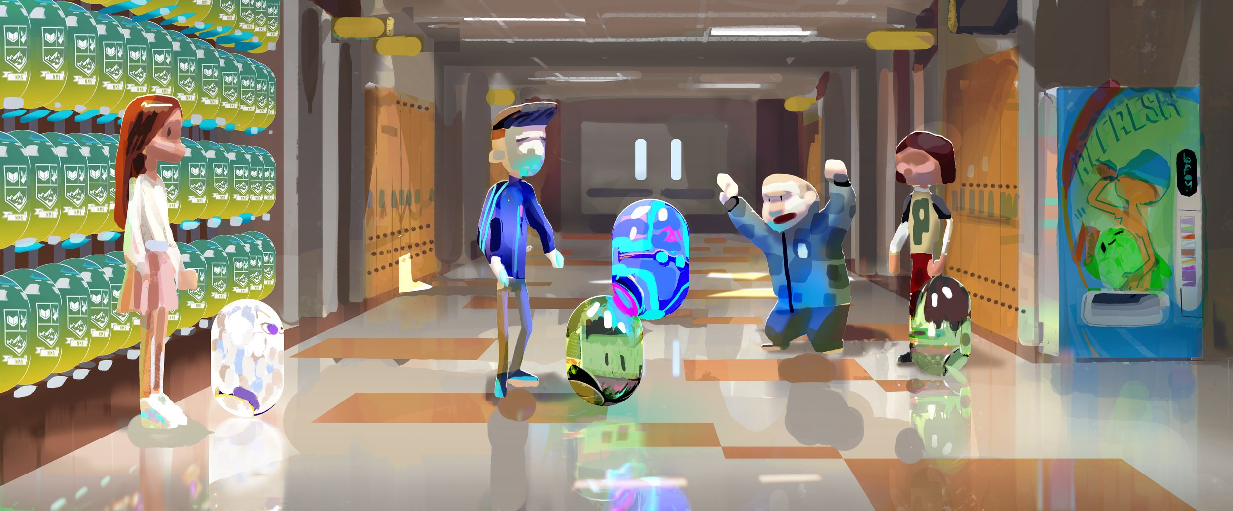
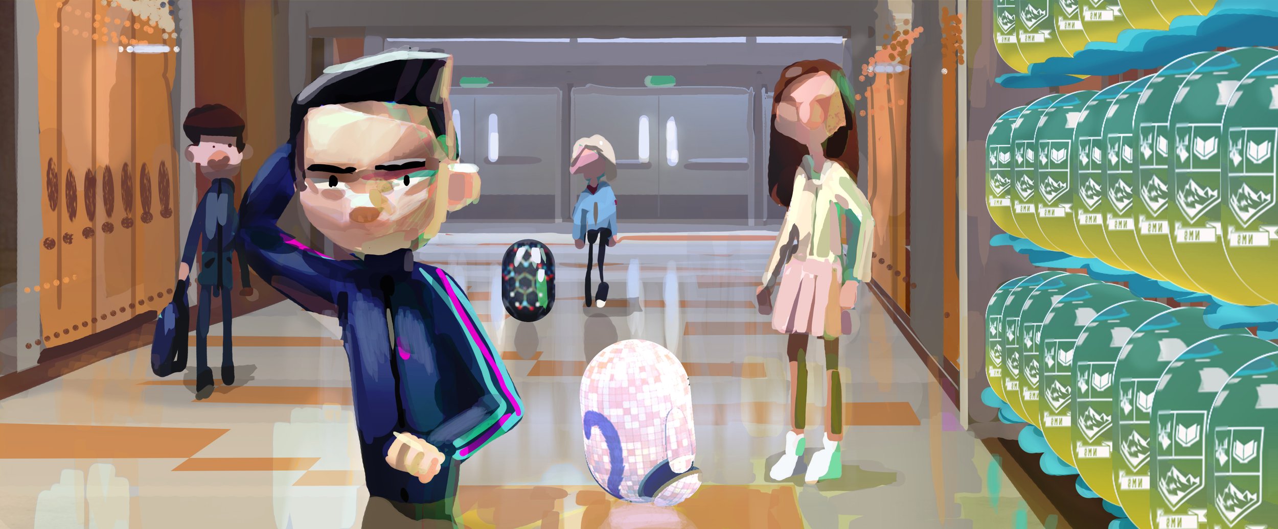
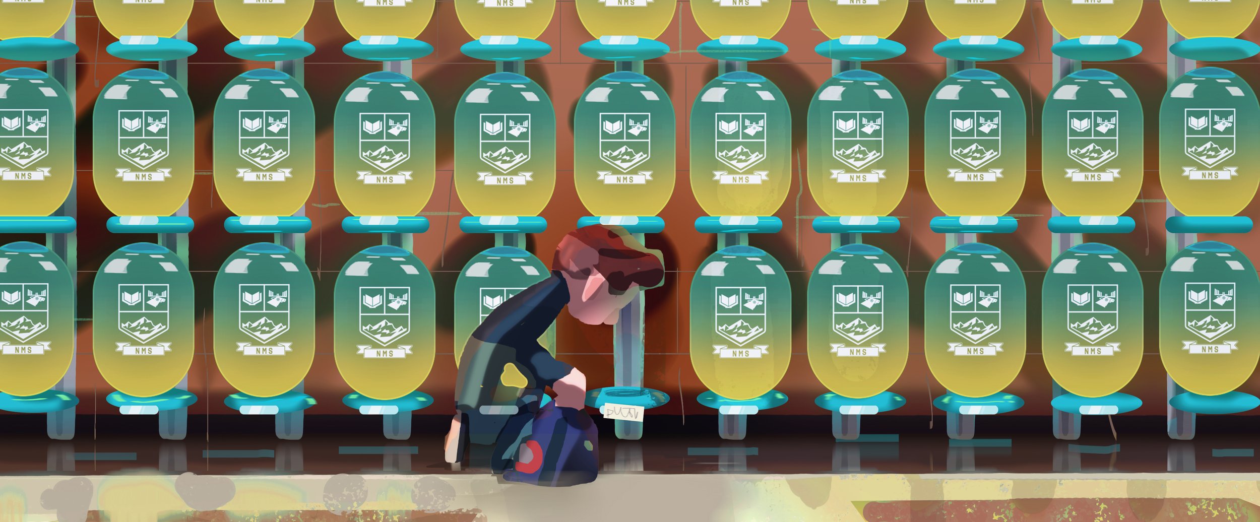
THE SCHOOL